Blue Ridge : UX audit reporting for smoother User experience
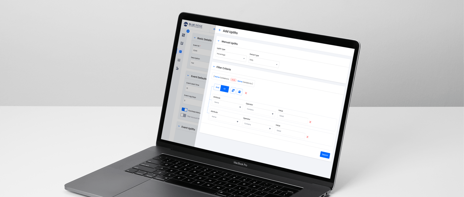
Company
Blue Ridge
Domain
Supply Chain
Service
UX Assessment, User Experience Design, Design System Language Development, User Interface Development
Technology
Figma, Maze Design
Platform
DSL
Company
Blue Ridge
Domain
Supply Chain
Service
UX Assessment, User Experience Design, Design System Language Development, User Interface Development
Technology
Figma, Maze Design
Platform
DSL
What Blue Ridge does?
Problem Statement
Solution Provided:
Accessibility
Implemented fix
The font size of the table heading is larger than the table content, making it easier to read.

Consistency
Implemented fix
Users can now view both graph view and table information in one scroll. Additionally, they can search within the table.

Error Prevention
Implemented fix
Created user-friendly forms with multiple sections for vital information gathering, real-time validations, and error prevention measures to ensure accurate data entry.


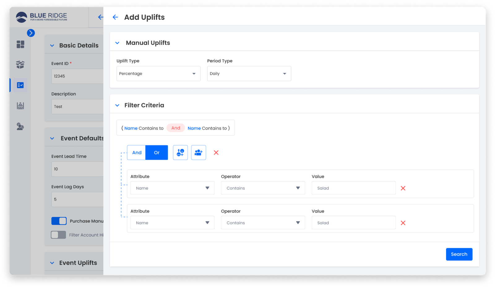
Usability
Implemented fix
Created a basic filter that requires only a few input fields and has validation for input values throughout the entire project.
- During the UX audit for Blue Ridge, we gathered additional details for inclusion in our UX Audit report.
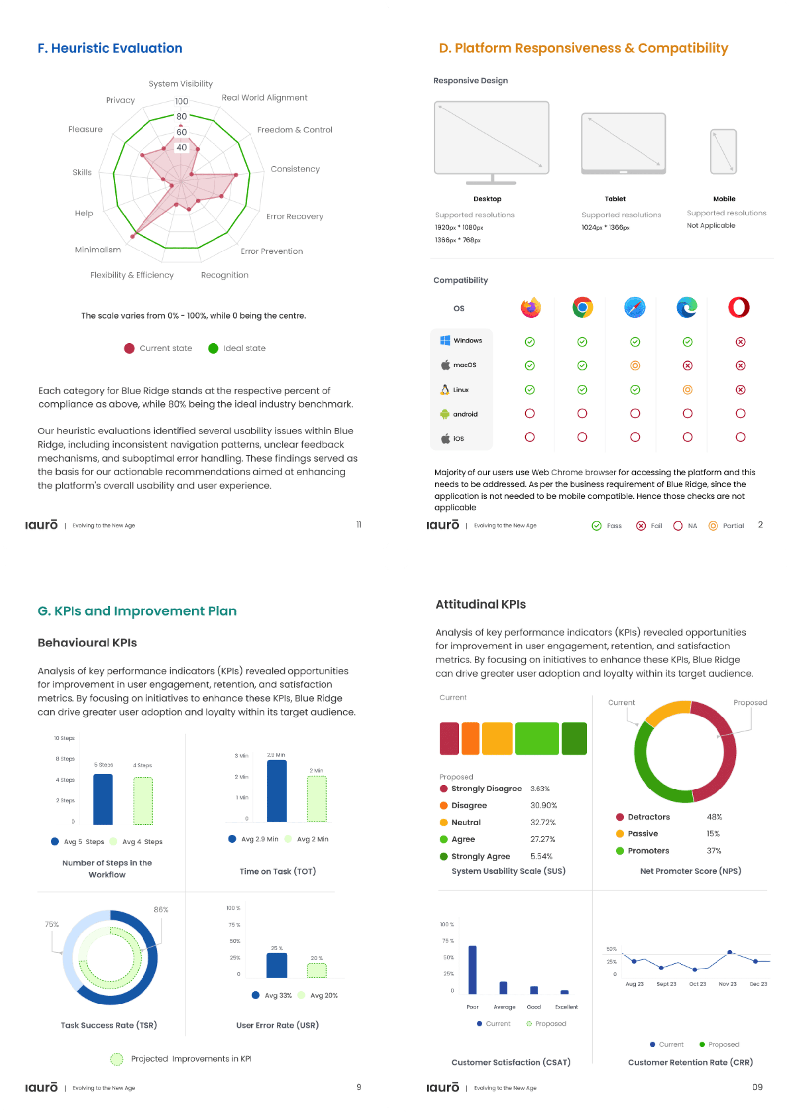
- Findings regarding platform responsiveness and compatibility revealed that the platform experienced compatibility issues with multiple browsers across major operating systems.
- The behavioral KPIs clearly indicate a significant opportunity for the platform to adopt inclusive design principles from the outset. There is a pressing need for the platform to adhere to web accessibility guidelines for online content and to support assistive technologies for digital accessibility.
Accessibility
Implemented fix
The font size of the table heading is larger than the table content, making it easier to read.

Consistency
Implemented fix
Users can now view both graph view and table information in one scroll. Additionally, they can search within the table.

Error Prevention
Implemented fix
Created user-friendly forms with multiple sections for vital information gathering, real-time validations, and error prevention measures to ensure accurate data entry.

Usability
Implemented fix
Created a basic filter that requires only a few input fields and has validation for input values throughout the entire project.
- During the UX audit for Blue Ridge, we gathered additional details for inclusion in our UX Audit report.
- Findings regarding platform responsiveness and compatibility revealed that the platform experienced compatibility issues with multiple browsers across major operating systems.
- The behavioral KPIs clearly indicate a significant opportunity for the platform to adopt inclusive design principles from the outset. There is a pressing need for the platform to adhere to web accessibility guidelines for online content and to support assistive technologies for digital accessibility.

Conclusion
This UX Audit revealed significant underlying issues that are impacting customer experience and in turn Blue Ridge’s business. Following are our key takeaways from the audit.
Issues revealed during UX Audit:
- Accessibility issues
- Inconsistent glossary for frequently used terms
- Need for improvement in course material load time
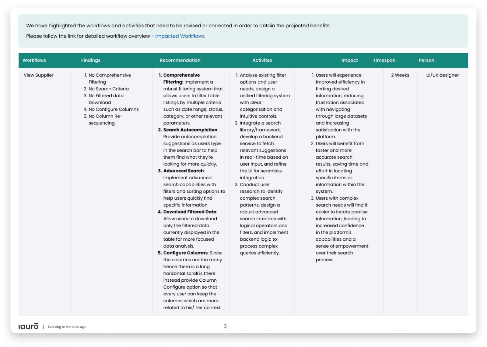
- Enhancement of search functionality
- Refreshing visual design with modern and engaging elements
- Simplifying the interface and prioritizing key information


